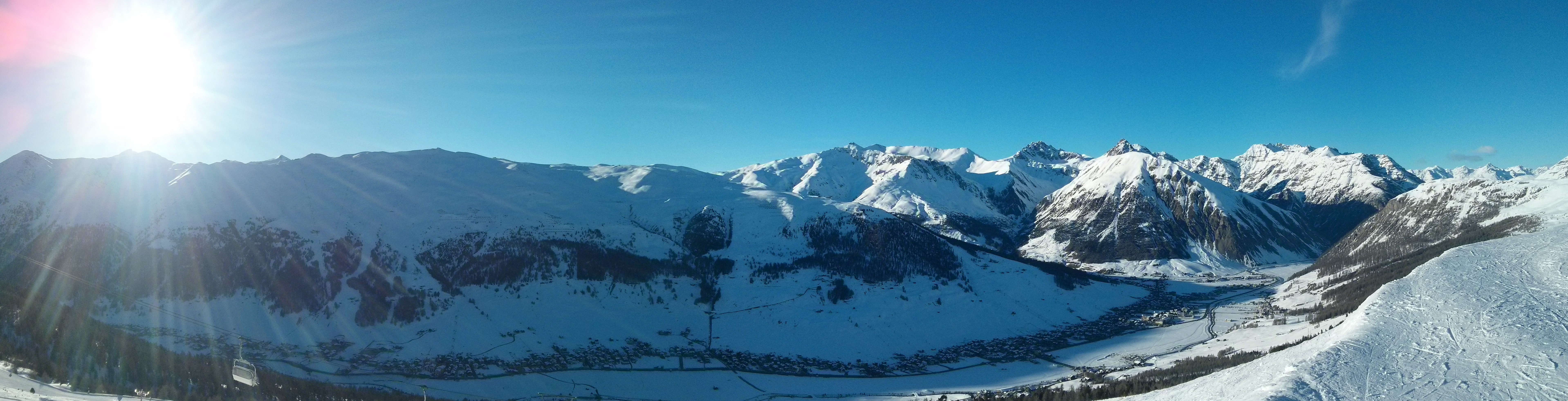
 Recently I went snowboarding with friends in Livigno, Italy. Everything was perfetto! The variety of slopes and parks was impressive. The weather couldn’t be better with fresh snow every morning and sunny days. It was a full week of pure fun, sport and leisure. This was my first time in Italy, in the winter, and I must say that I love it as much as I love it in the summer.
One thing that I did almost the next day when I got back home, was to check the lift pass statistics as suggested on my pass at http://www.skipasslivigno.com/skicheck/
When I entered my pass number I was surprised that I received only one .csv file that if I open in Excel I will see raw data of few columns and many rows, representing all my lift entries. We also gathered with friends to compare and discuss when and where someone of us was riding. As you can imagine it was hard to compare anything using text editors.
And by talking with others I heard that it is common for other resorts also.
As a data visualization fan, I thought that it would be nice to have a way to visualize all of this raw data, in a user friendly way. I wanted to see which slopes/lifts I was riding the most, which my friends were riding, when and where we were together, when we were riding on opposite slopes and how our days were going. So I went over the stats and started experimenting with ideas, how such statistics will be nice to be shown.
So I started building a ski stats visualization library, having my own and my friends’ stats from Livigno. I can say that it is now ready for preview and I wanted to get feedback for it. You can see a demo of it here http://tgeorgiev.github.io/skistats/ . It is fully functional, so if you have visited Livigno and have your ski pass statistics, go ahead and provide them to see you visualizations. There is also a demo mode, that shows fake data, to have a better feeling of the project.

It is still in early development stages, so if you find any issues, have feature requests or want to see stats for other resorts, please open a new issue in the GitHub project page or comment your thought bellow this post. You can also check here how you can contribute.
—Implementation details bellow—
I have pushed version 0.0.1 into GitHub under MIT license. Feel free to use it and improve it.
The library is built on top of D3.js and Raphael. Consumers of it, can use different components that can be used independently or integrated to bring better experience to end-users. Two main components are
- The Map component is used to display map of a ski resort, with interactive SVG elements of the ski lifts and can display the participants riding a lift at a given time. It can be used standalone, to provide users an interactive display of a resort map.
- The Timeline component displays all registered lift runs. It is used to show a timeline of all entries with time-blocks representing the participants riding different lifts. Supports zooming and panning, for digging in greater detail.
When using both they are integrated and can provide even richer experience showing participants riding a lift at the current time.
It is implemented in a way to support many resorts, by providing a resort strategy. Currently there is strategy only for Livigno, if you want to see more resorts you can help by:
- Opening a new issue and specifying which resort you want to see visualizations for. Please also provide the stats you have for your ski pass, so that it is easier for us to see what is provided and what we can use.
- Creating a new strategy. Instructions on how to create a new strategy can be found here
More detailed information can be found in the GitHub page of the library. I am releasing it under MIT license, so feel free to use it and improve it.
Happy skiing/observing!
