Visualizing ski pass statistics from Livigno

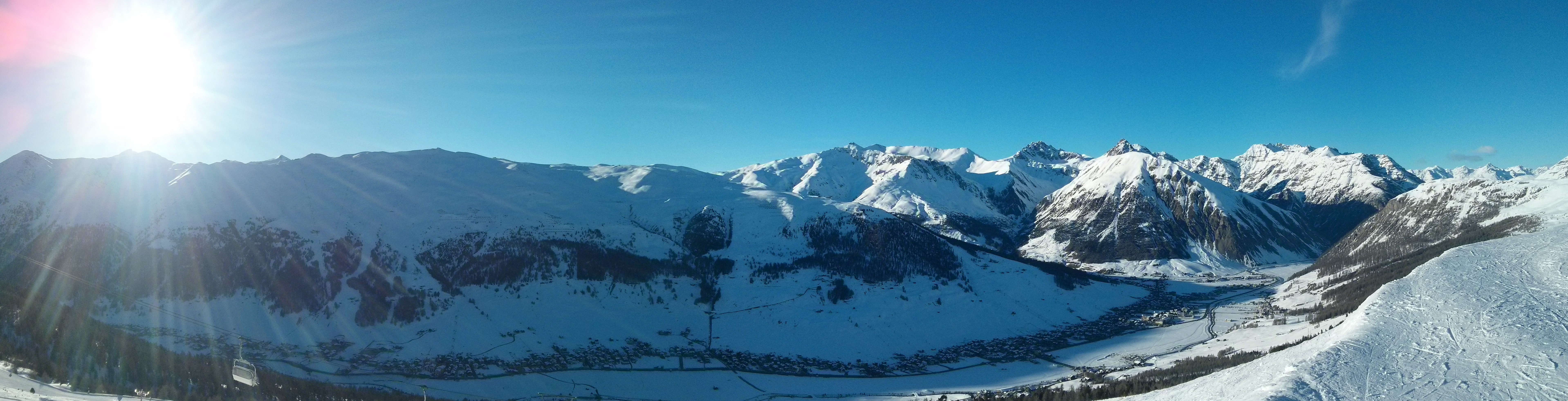
Recently I went snowboarding with friends in Livigno, Italy. Everything was perfetto! The variety of slopes and parks was impressive. The weather couldn’t be better with fresh snow every morning and sunny days. It was a full week of pure fun, sport and leisure. This was my first time in Italy, in the winter, and I must say that I love it as much as I love it in the summer.

One thing that I did almost the next day when I got back home, was to check the lift pass statistics as suggested on my pass at http://www.skipasslivigno.com/skicheck/

When I entered my pass number I was surprised that I received only one .csv file that if I open in Excel I will see raw data of few columns and many rows, representing all my lift entries. We also gathered with friends to compare and discuss when and where someone of us was riding. As you can imagine it was hard to compare anything using text editors.

And by talking with others I heard that it is common for other resorts also.

As a data visualization fan, I thought that it would be nice to have a way to visualize all of this raw data, in a user friendly way. I wanted to see which slopes/lifts I was riding the most, which my friends were riding, when and where we were together, when we were riding on opposite slopes and how our days were going. So I went over the stats and started experimenting with ideas, how such statistics will be nice to be shown.

So I started building a ski stats visualization library, having my own and my friends’ stats from Livigno. I can say that it is now ready for preview and I wanted to get feedback for it. You can see a demo of it here http://tgeorgiev.github.io/skistats/ . It is fully functional, so if you have visited Livigno and have your ski pass statistics, go ahead and provide them to see you visualizations. There is also a demo mode, that shows fake data, to have a better feeling of the project.

Skistats screenshot

It is still in early development stages, so if you find any issues, have feature requests or want to see stats for other resorts, please open a new issue in the GitHub project page or comment your thought bellow this post. You can also check here how you can contribute.

Read More

Flex/Flash chart libraries

Hey there!

I’ve been developing different Flex applications for some time and recently I am working on a charting component build on Flex. I was using flex data visualization framework, and I loved it. It was very easy to visualize different kind of data, and to create custom components. There were some issues, but you could fix them. Everything good, but this framework isn’t free… That wasn’t a problem for me as I already had a license, a student license for Flex Builder 3 Pro which Adobe kind fully gave me. But friends of mine and colleagues are not able to receive it, so they have the chance either to buy Flex Builder Pro license (which goes with data visualization) or to search for a free alternative

Here I will discuss the 3 best alternatives, from my point of view.

But first let’s see how the Flex data visualization looks like, and how can we use the other libraries to display it like that

And we’re of on the adventure of searching the best Flex/Flash chart library…
Maybe the first result you encounter, when you Google “flash chart” is

  • Open Flash Charts. It is a charting library build on actionscript. As you may see from the examples it is very elegant and easy to set up. It reads JSON data to do the configuration and there are different libraries for JAVA, Python, php that make it easier. There is even a very good extension so that you can use it as a flex component and a charting explorer that you can find here. The good thing is that is easy to display simple charts (well sometimes it’s really tough when you write your own JSON object) and it is very lightweight (only actionscript) The bad is that if you want to change, modify something it’s really hard.

    Here is a simple example of a Line Chart made with Open Flash Charts

  • Axiis I have followed Axiis a long time ago, from the first posts of Thomas Gonzales and Michael VanDaniker but never had the chance to try it until now. It is an open source data visualization framework for Flex based on Degrafa. At first I was a bit confused with all those geometry repeaters, but head on trying it and I saw that it was very easy to configure whatever you like, and it’s very flexible. If you’ve done some work using Flex Data visualization you will find it very easy and intuitive to create your own charts. It is new, still beta but at this stage very popular. It’s free, It’s on google code… what more can you wish for 🙂

    Example of Line Chart created with Axiis

  • Flare is another actionscript library, port of Prefuse for JAVA. Unfortunately I haven’t researched a lot for this framework, but at first sight I found it very complex and not as intuitive as Axiis. Check out the examples to see how complex visualization you can make. It’s great for transitions and effects you can create. It’s advantage over the other two libraries is it’s complexity, but it’s also it’s disadvantage, if I may say. What I mean is, that if you want more complex visualizations you definitely would like to grab Flare, but for other cases when you want just a simple line, bar or pie chart it’s better to choose something else.

    [Example]

I will upload source code if there is interest. See also a comprasion between Flare and Axiis http://www.pathf.com/blogs/2009/05/flare-vs-axiis/ And now which library suits you best?